Having just returned from the SICB 2014 meetings, the appearance of many people’s Powerpoint figures is fresh on my mind. The sheer number of tiny figure labels (tick marks, axis titles, legend text etc) is disappointing. If we want to point fingers, MATLAB users are clearly the worst offenders because of the microscopic default label sizes in that program, but there are plenty of illegible R and matplotlib figures out there as well. Excel is obviously its own special class of terrible, but we will speak of it no more. The default settings in most of these programs are designed for print display, where small font sizes are usually fine. But when you try to put that print-optimized figure up on a low resolution projector on a small screen in a large meeting room, text becomes unreadable very quickly.
What follows below are some simple examples of how to expand the figure labels on R plots generated using the base plot() command. In my typical workflow these days, I’m writing all my R code inside a knitr file to generate TeX and pdf files for distributing to collaborators. As usual, the defaults here are tailored for printed material, so when I decide I need a figure for a slide presentation, I modify one of my existing plotting code sections to scale up the font sizes and output as a 1024×768-pixel PNG graphic file (similar to a JPEG, if you’re unfamiliar with PNG). The PNG file is nice because the memory size is tiny, it doesn’t introduce ugly artifacts like JPEG does, and Powerpoint or Keynote can’t screw up the scaling of the contents of the figure like they might with a vector format. Furthermore, a raster image format such as PNG will transfer back and forth between Mac and PC versions of presentation software without changing. Even if the PC in the meeting room destroys the rest of your fancy PowerPoint animations and text sizing and whatever other visual abominations you’ve created, the PNG figures will just work. The majority of slide projectors are still 1024×768 resolution or lower, so you know a PNG file at that resolution will fill the frame and look good, and you can always click-and-drag to shrink the image down to fit inside the rest of your existing slide design. Eventually high-def projectors (1920×1080) will become more common, in which case it will be useful to bump up the size of the PNG that R is outputting to match that higher resolution. The primary downside to using PNG figures in your presentation is that you can’t tweak individual elements of the figure after it’s made. Instead you need to go back to your R code, tweak there, and generate a new version of the PNG file.
Let’s start by making up some fake data and placing it in a data frame called df.
[code lang=”r”]
df = data.frame(x = rnorm(30), y = runif(30,min = 10,max = 10000),
dates = seq(as.Date(‘2013-12-01’),(as.Date(‘2013-12-01’)+29), by = 1))
[/code]
Then make a basic plot of the x and y data. The plot command is preceded by the png()
function that opens and begins writing plot data to a new png file, and is followed by the dev.off() function to close and save the png file. Note that the arguments for the png file include the width and height of the output file in pixels. The png output file will be saved to your current R working directory in this case. R will not produce an on-screen version of the figure in this case since it writes the figure directly to disk.
[code lang=”r”]
# The default plot might be fine on screen and in print, but is too small
# for a slide presentation
png(file = ‘pngtest1.png’, width = 1024, height = 768, units = "px")
plot(y~x, data = df, las = 1)
dev.off() # close plot and save to disk
[/code]

That is roughly where most people stop when they make a plot for a presentation, but clearly things are far too small to read from the back of the room in a meeting. So we’ll use the cex argument inside the plot command to increase the size of the plotted points and the cex.axis argument to increase the size of the numbers on both axes labels. You could also include a cex.lab argument to increase the size of the axis titles.
[code lang=”r”]
png(file = ‘pngtest2.png’, width = 1024, height = 768, units = "px")
plot(y~x, data = df, las = 1,
cex = 2, # expand data point size
cex.axis = 2.5) # expand axis tick labels
dev.off() # close plot and save to disk
[/code]

For a lot of figures that slight modification to the plot command might be sufficient, but I’ve purposely made the y-axis values too large to fit inside the default margin. To fix this, before we submit the plot() command, we’ll issue a par() command to modify the default margins.
[code lang=”r”]
png(file = ‘pngtest3.png’, width = 1024, height = 768, units = "px")
par(mar = c(5,10,1,1))
plot(y~x, data = df, las = 1,
cex = 2, # expand data point size
cex.axis = 2.5) # expand axis tick labels
dev.off() # close plot and save to disk
[/code]

Now the axis values fit inside the figure dimensions, but the axis titles are still tiny and in the wrong place. We’ll fix the y-axis title by blanking it out inside the plot() and then manually inserting it with the mtext() function. The same could be done with the x-axis title if you want to customize its size and placement. For the mtext() function, the arguments include side = 2 to put the text on the 2nd (y) axis, line = 7 to move the text out to the 7th line of the 10 lines of space we created with the par() function earlier, and cex = 3 to make the text large and readable.
[code lang=”r”]
png(file = ‘pngtest4.png’, width = 1024, height = 768, units = "px")
par(mar = c(5,10,1,1))
plot(y~x, data = df, las = 1,
cex = 2, # expand data point size
cex.axis = 2.5, # expand axis tick labels,
ylab = ”) # blank y axis label
# create y label
myYlabel = "Some response variable"
# print y label on current plot
mtext(myYlabel, side = 2, line = 7, cex = 3) # side = 2 puts label on the y-axis
dev.off() # close plot and save to disk
[/code]

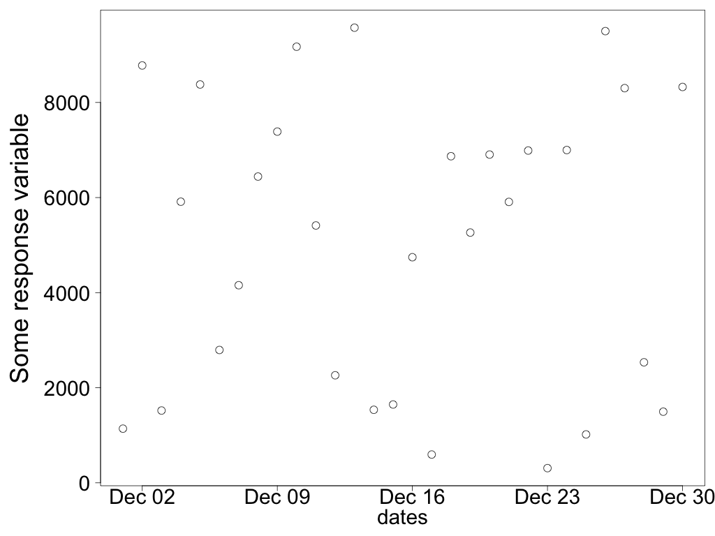
Next I’ll change the x-axis data to use the dates stored in the data frame. Because the dates column is of the Date type, R will properly interpret the values as dates and use appropriate x-axis tick mark values.
[code lang=”r”]
# Switch to plotting dates on x axis
png(file = ‘pngtest5.png’, width = 1024, height = 768, units = "px")
par(mar = c(5,10,1,1))
plot(y~dates, data = df, las = 1,
cex = 2, # expand data point size
cex.axis = 2.5, # expand axis tick labels,
ylab = ”, # blank y axis label
cex.lab = 2.5) # Expand axis titles (only x axis title is visible)
# create y label
myYlabel = "Some response variable"
# print y label on current plot
mtext(myYlabel, side = 2, line = 7, cex = 3)
dev.off() # close plot and save to disk
[/code]
What if you don’t like the Dec 02 style of labeling on the x-axis? You can blank out the x-axis tick marks and labels inside the plot() command and place them manually with the axis() and mtext() functions.
[code lang=”r”]
# Manually plot x axis dates with custom formatting
png(file = ‘pngtest6.png’, width = 1024, height = 768, units = "px")
par(mar = c(8,10,1,1)) # expand figure margins to fit the large axis titles
plot(y~dates, data = df, las = 1,
cex = 2, # expand data point size
cex.axis = 2.5, # expand axis tick labels,
ylab = ”, # blank y axis label
xlab = ”, # blank x axis label
xaxt = ‘n’) # blank x axis tick marks
# create y label
myYlabel = "Some response variable"
# print y axis title on current plot
mtext(myYlabel, side = 2, line = 7, cex = 3)
# print x axis tick marks
axis.Date(side = 1, # side 1 is the x axis, side 2 is the y axis
at = pretty(df$dates), # pretty() chooses nicely spaced tick marks
format = "%b %d", # axis.Date accepts a date formatting argument
cex.axis = 2.5, # increase date label size
padj = 1) # shift labels down away from axis slightly
# create x label
myXlabel = "Sample dates, 2013"
# print x axis title on current plot
mtext(myXlabel, side = 1, line = 6.5, cex = 3)
dev.off() # close plot and save to disk
[/code]

What if you want more date values plotted on the x-axis? You can force the pretty() function to produce a minimum number of tick marks.
[code lang=”r”]
# Manually plot x axis dates with custom formatting
# Force more x tick marks to appear, which squeezes tick mark labels and may
# leave out some labels
png(file = ‘pngtest7.png’, width = 1024, height = 768, units = "px")
par(mar = c(8,10,1,1)) # expand figure margins to fit the large axis titles
plot(y~dates, data = df, las = 1,
cex = 2, # expand data point size
cex.axis = 2.5, # expand axis tick labels,
ylab = ”, # blank y axis label
xlab = ”, # blank x axis label
xaxt = ‘n’) # blank x axis tick marks
# create y label
myYlabel = "Some response variable"
# print y axis title on current plot
mtext(myYlabel, side = 2, line = 7, cex = 3)
# print x axis tick marks
# print x axis tick marks
axis.Date(side = 1, # side 1 is the x axis, side 2 is the y axis
at = pretty(df$dates, min.n = 6), # force at least 6 tick marks
format = "%b %d", # axis.Date accepts a date formatting argument
cex.axis = 2.5, # increase date label size
padj = 1) # shift labels down away from axis slightly
# create x label
myXlabel = ‘Sample dates, 2013’
# print x axis title on current plot
mtext(myXlabel, side = 1, line = 6.5, cex = 3)
dev.off() # close plot and save to disk
[/code]

The downside to this attempt is that R can’t properly fit all of the tick mark labels in there because we’ve increased the text size, so it drops many of the labels. One solution is to not let axis() place the text labels, and instead use the text() function to rotate and place the text labels on the x-axis.
[code lang=”r”]
# Rotate x-axis tick labels so they fit better.
png(file = ‘pngtest8.png’, width = 1024, height = 768, units = "px")
par(mar = c(8,10,1,1)) # expand figure margins to fit the large axis titles
plot(y~dates, data = df, las = 1,
cex = 2, # expand data point size
cex.axis = 2.5, # expand axis tick labels,
ylab = ”, # blank y axis label
xlab = ”, # blank x axis label
xaxt = ‘n’) # blank x axis tick marks
# create y label
myYlabel = "Some response variable"
# print y axis title on current plot
mtext(myYlabel, side = 2, line = 7, cex = 3)
# print x axis tick marks, but leave labels blank
axis.Date(side = 1, at = pretty(df$dates, min.n = 6), labels = FALSE,
cex.axis = 2)
# We’ll use the text() function to print the rotated labels, but first we need
# to figure out where the lower limit of the y-axis is so that we can draw
# text below it
xlow = par()$usr[3] # 3rd value is minimum y value
op = par(xpd = NA) # turn off clipping
text(x = pretty(df$dates, min.n = 6), # specify location of labels relative to x
y = xlow, # specify location of labels relative to y-axis
labels = strftime(pretty(df$dates, min.n = 6), format = ‘%b %d’),
srt = 45, # rotate text 45 degrees
cex = 2, # enlarge labels
adj = c(1.1,1.2)) # move label position to line up under tick marks
# Using the adj argument to move rotated tick labels is weird. If the value is
# (0,0), the base of the first letter/number will sit just above the tick
# mark. Adjusting the first value to adj = c(1,0) will move the label so the
# end of the last character of the label is to the left and below the tick mark.
# You’ll still want to move the label down a bit further, and probably move it
# to the right in the process, so play with both values of adj = c(1.1,1.2)
par = op # reset plotting options to turn on masking
# Place a x-axis title
mtext(‘Sample dates, 2013’, side = 1, line = 6.5, cex = 3)
dev.off() # close plot and save to disk
[/code]

Hopefully that gives you some indication of how to customize your basic plots to make them legible on a projector screen. If you want to learn about the various cex arguments, enter ?par at the R command line to open the help file for the par() function. The majority of the cex arguments listed there work within the plot() functions.