![]() Image Studio Lite is a free software package from LI-COR Biosciences aimed at life scientists that want to analyze gels, western blots, dot blots, and other similar lab outputs. Although the Lite version is free, there is a more comprehensive paid version of the software that aims to easily integrate with the apparatus that Licor also sells. However, the free Image Studio Lite is more than sufficient for basic analysis of western blots, as I’ll show below.
Image Studio Lite is a free software package from LI-COR Biosciences aimed at life scientists that want to analyze gels, western blots, dot blots, and other similar lab outputs. Although the Lite version is free, there is a more comprehensive paid version of the software that aims to easily integrate with the apparatus that Licor also sells. However, the free Image Studio Lite is more than sufficient for basic analysis of western blots, as I’ll show below.
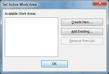
Obviously you need to start by downloading and installing Image Studio Lite. The first time you fire up the software after installation, it will prompt you to specify a folder on disk where the contents of your analyses will be stored (Figure 1). It will keep copies of your images, as well as logs of the operations you carry out. This goes a long ways towards helping the reproducibility of any analyses you do, since it will store all of the lanes, labels, and other things you draw on your images, along with the calculated values.
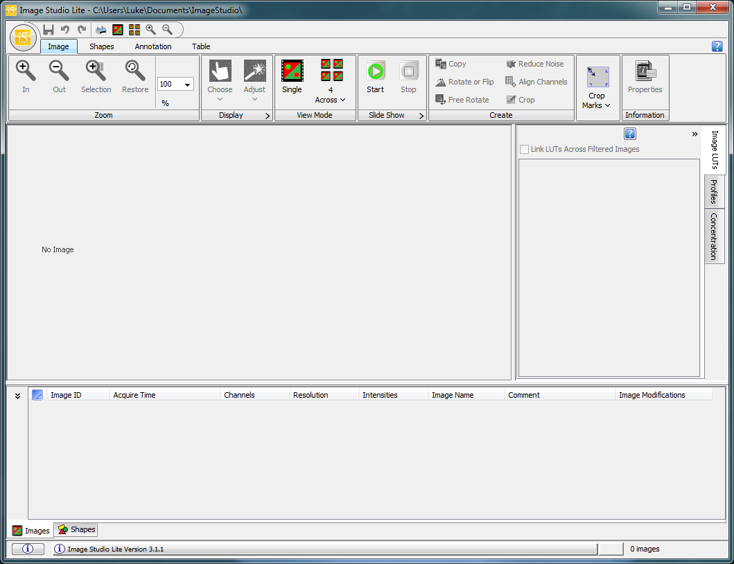
After that little diversion, you’re presented with the main Image Studio window (Figure 2).
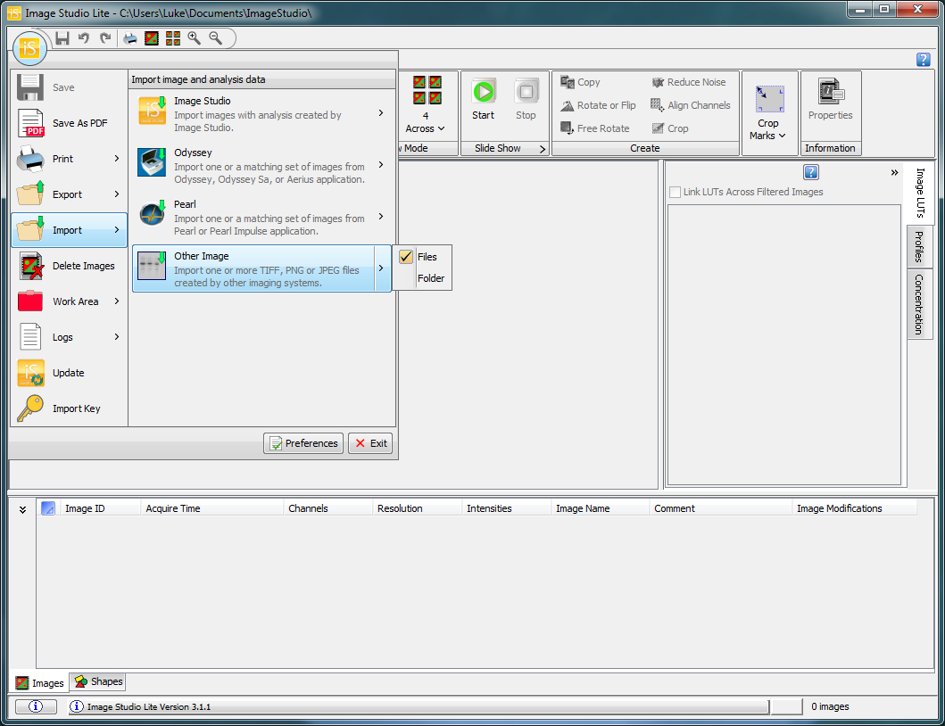
The first task is to load the western blot image. In the upper left of the screen, you’ll find the Image Studio logo. Click on that, and you’ll find a menu full of options (similar to how recent versions of Microsoft Office hide menu items behind a logo). Go to Import>Other Image (Figure 3). Follow the file selection dialog to open your image. In this case I’ll open a tiff image created from a scanned piece of x-ray film produced from a western blot.
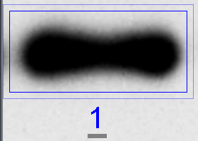
The first time I loaded up my tiff image, I was greeted by the slightly panic-inducing black blob seen below (Figure 4). It didn’t look like my original image, but I think that’s because Image Studio was trying to guess at the best display setting and simply missed.
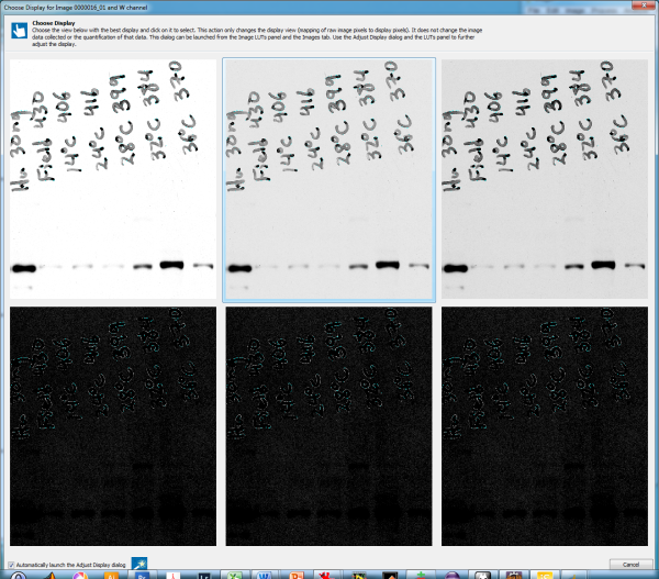
It’s easily corrected though, and illustrates one of Image Studio Lite’s handy options. Click on the little hand icon near the right edge of the main window, below the brightness and contrast sliders. This brings up the following Display Image window (Figure 5), where several different versions of the original image are shown. The goal is to let you choose a display setting that will make it easiest to find your bands. I chose the top center image. If you run into a situation where your particular image won’t open correctly even with these adjustment options, you can contact LI-COR support so that they can determine how best to accommodate your image format (Licor support: http://www.licor.com/contact/
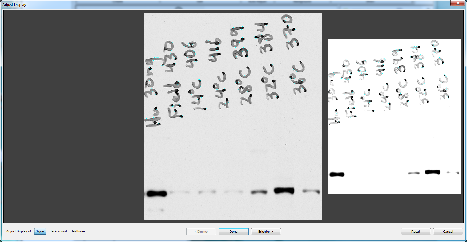
After clicking on the top center image, a second Adjust Display window opens (Figure 6). Here you can further tweak the display of the image by choosing among tweaked versions that shift the signal, background or midtones of the image. It’s important to note that the choices you make here (and in the previous Display Image window) only affect what you see on the screen, they don’t change the underlying data in the image file. The goal is to make it easy for you to find and identify bands by eye, but the raw numbers you get out of the pixels during the analysis won’t be changed.
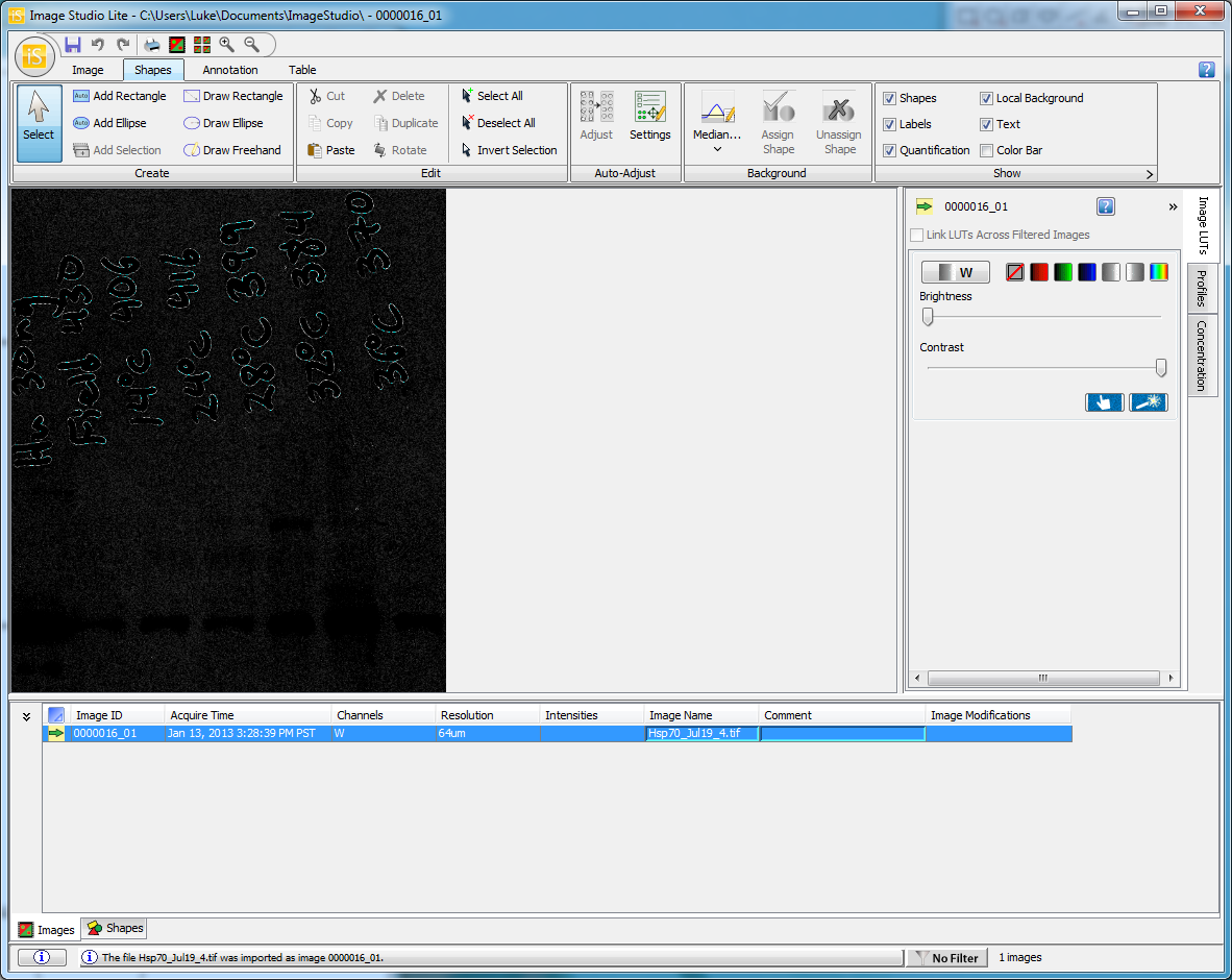
Returning back to the main Image Studio window, the western blot image is now displayed properly. In this case, I’m working with a tiff image from a western blot that was digitally scanned off of a piece of x-ray film, because I’m old school, or just old. You might be working with a fancy laser scanner image, or a digital image from a gel camera, but the concepts are similar. My example blot (here’s a copy of the original file) includes a sample of Human Hsp70 protein purchased from a commercial provider, which I was using as my sample standard in the far left lane on this project. The remaining lanes are samples of Hsp70 from rocky intertidal limpets that were exposed to various levels of heat stress.
The next step is to switch to the Shapes tab near the top of the main Image Studio window. This tab provides the tools to select the bands you want to analyze. I use the basic Draw Rectangle button. There are additional options like the auto Add Rectangle, but I keep finding that I have to manually adjust the auto-rectangles, so it’s easier to just start with a custom rectangle. I draw the first rectangle large enough to encompass the band in the first lane, but also making sure that it will be large enough to also cover the same band in any of the remaining lanes (Figure 7).

At this point, you might want to see what sort of values show up for your highlighted band. First, you can see the profile plot of the band by clicking the Profiles tab on the far right edge of the main window. This shows a visual representation of a slice through your rectangle. Second, you should click on the Shapes tab at the very bottom of the main window (Figure 8). This shows several columns of numbers for the band you highlighted.

I then switch to the Add Selection button up in the Shapes tab. Returning to the image, it’s then a matter of simply clicking once on the next band I want to box, and Image Studio Lite will place an identically-sized box on the image (Figure 9). You may need to click and drag the box around a bit so it sits properly centered over the band.
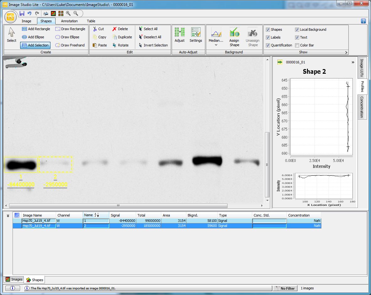
Repeat this process of clicking on each subsequent band with the Add Selection tool, and you’ll quickly have each of the bands covered by an equally-sized rectangle. The data for each band will be shown in the lower portion of the main window as you add them (Figure 10).

For this basic analysis, the quantity I’m concerned with is the Signal column. You’ll note that my values are all negative. This is just a function of the way the program deals with the grey values stored in my tiff. If you’re dealing with a gel image where the bands are lighter than the background, your values should come out positive. Either way, the important point is that the higher density bands with more protein in them have larger absolute values (very negative in my case). Incidentally, if your bright bands return with a value of Infinity, this is an indication that your blot image was overexposed. See this explanation of why this should concern you and what to do about overexposure.
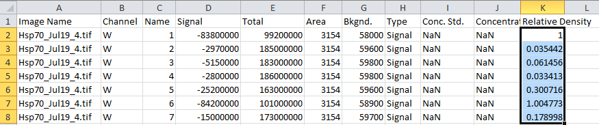
With the raw signal values, I can now calculate the relative density of all of the sample bands relative to my Human Hsp70 sample standard. To begin with, you can simply highlight all of the data rows in the Shapes tab at the bottom of the window, copy them, and paste them into Excel. Alternatively, you can go to the Table tab and click on the Launch Spreadsheet button, which will create and open a new Excel file with your data in it (Figure 11).

I’ll normalize everything to the sample standard of human Hsp70 in the first lane by dividing each Signal value by the first row’s Signal value (Figure 12).

After calculating the relative density for each row, using row 1 as the standard, I have a set of values of the relative density for each band in the other lanes (Figure 13). As you’d expect, the band in lane 6 is very close to 1.0 since it’s just as dark as the standard, while the sample in lane 2 is very close to zero, since it’s a very faint signal. There are no units for these values, they are simply percentages relative to the standard. If I used the same standard on all my other blots to normalize the density values within a blot, I could compare my percentage values for this blot to the percentage values for other blots. This analysis is just what I did in the original ImageJ western blot tutorial I wrote here.
Those are the basic steps for analyzing a simple western blot with Image Studio Lite. If you click the Save icon on the ImageStudio menu bar, all of your current analysis data will be saved, along with any modifications you’ve made to the image to make it easier to view. This is a notable strength of Image Studio Lite, since you can return to the saved analysis months later and see just what you did to get your numbers. There are many more options found within the program, some of which I’ll discuss below, and of course more info can be found in the program’s help files.
Additional info
Background Correction
The background noise correction options are worth a little more exploration.
By default, Image Studio Lite implements a background correction to account for the background density present in your image. If you over-expose your gel or blot, whether it’s on a scanner or it’s simply xray film, background noise will start to show up, which will influence the readings of your bands. Now, if the background noise is consistent across the entire blot, it shouldn’t impact your density readings appreciably, since every band will be shifted by the same amount. But if you have varying levels of background noise across your lanes, some method of background noise compensation is nice.
The default Image Studio method is to define a narrow band outside of your selection shape (the rectangles we drew earlier), and use the pixels in that narrow band to define the background signal (Figure 14).
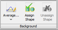
On the Shapes tab in the Background section, you can set how this background correction is calculated, either as the Average or the Median of the pixels in the band (Figure 15).
Alternately, you could choose “None” for the correction, which leaves only the Total column in the results area, as the Signal column will turn to NaN with no background correction. If you abandon background noise correction by choosing the “None” option, you’ll just use the values in the ‘Total’ column to make your relative density calculations. (This Total value works for images where the bands are lighter than the background, but it doesn’t work on the particular image I’m using here, where the bands are darker than the background.)
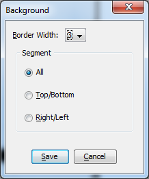
When you switch between Median and Average for the background correction, a dialog box will pop up asking you to choose how you want that border of pixels to be set up (Figure 16). You can choose the border width, and choose whether you want all 4 sides of the border to be factored in, or only the top/bottom or right/left sides. This adjustment will be handy if you have gels where adjacent bands are very close together and would bleed into the background border area around your selection. Always keep an eye on what’s in the background border area, since you don’t want a neighboring band to influence the reading for the band you’re trying to measure.
A fourth option under the Shapes>Background sections is “User-defined”. With the user-defined option, you can draw a custom shape somewhere on the image, and the pixels inside that shape will be used to calculate the background signal for every other shape that you place on the image. To use the user-defined option, you must first draw a shape on the image and set it over the area you want to use as the background sample (Figure 17).
In the figure above (Figure 17), I’ve drawn a small rectangle just outside of the area where I want to make my band measurements. I then click on the Assign Shape button, and the following dialog shows up (Figure 18):

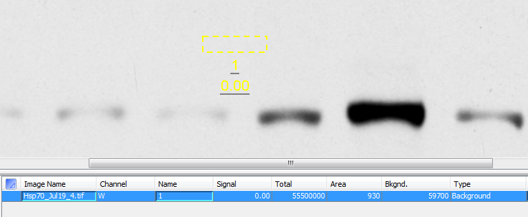
The rectangle I drew is then used to calculate the background signal. The background noise value will be removed from any subsequent bands I measure. As was already shown above (Figures 8 – 13), the basic analysis procedure is to then draw a rectangle around a band, and make that rectangle large enough that it will enclose any of the other bands you will want to measure. You want to keep the area selected around each band constant between lanes so that you’re measuring the same total area. After drawing the first box, you can choose the Add Selection button in the Shapes tab and click to place each of the other rectangles over bands you want to measure. The outcome looks like Figure 19:

In this case, my background sample rectangle is sample 1, and it’s listed as a Background under the Type column. The remaining 7 values are the seven bands in my lanes. Because we’re using the background correction functionality of Image Studio Lite, we’ll use the Signal values to calculate the relative density of the bands. As a reminder, my signal values are negative here because my high-density values are darker than the background. If your high-density bands are lighter than the background, your signal values will be positive.
Calculating the relative density of the seven sample bands is the same as outlined above. The quickest method is to go the Table tab and click on the Launch Spreadsheet button to create and open a new Excel spreadsheet containing the data. In a new column, divide the Signal for that row by the Signal value for the sample standard band (Figure 20). In the figure below, my sample standard is the 2nd row (because the 1st row was the background correction). I divide all of my signal values by my sample standard’s signal value, as shown in column K.

The resulting values are the relative densities of each band, relative to the sample standard in lane 1 of my blot (2nd row of values in the spreadsheet, Figure 21). Notice that I didn’t do anything with the Background value in the spreadsheet, because its value was already factored into the Signal values produced by Image Studio Lite.

Annotation
Image Studio Lite provides you with a set of tools to insert text labels and arrows on your image as well. You might find this useful for producing output for a publication, for example.

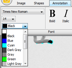
On the Annotation tab (Figure 22), you’ll find several options for inserting and modifying the appearance of labels. To start with, on the far left of the tab, you’ll find pull-down menus to choose the font, size and color of labels you add to the image (Figure 23).
You can then use the Add Text button on the Annotation tab to start inserting labels for lanes. You will have the option to change the positioning, size and exact text after you place text.
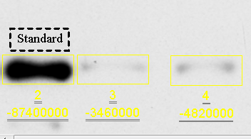
In Figure 24 above, I’ve labeled my first lane as the standard. Initially the text will have the dashed box around it, but this is simply to inform you that this piece of text is now selected, and you can drag/drop it where you need to. The dashed box will disappear once you create another piece of text or select something else. If the Add Text button is still selected, you can click at a new location and type the next label. When I finished labeling, my blot looked like Figure 25:

For publication purposes I wouldn’t necessarily want those yellow boxes and labels present, I’d only want my lane labels. However, if you want a copy for your lab notebook, you might keep everything. To choose which objects are displayed, switch back to the Shapes tab. There you’ll find the Show section, with check boxes to control which objects are being displayed (Figure 26).
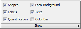
You can uncheck the boxes for Shapes, Labels, Quantification and Local Background, leaving only the Text box checked. The image then looks like Figure 27.

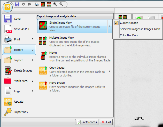
If you go to the Image Studio Lite icon in the upper left, you’ll find an option to Export the current image (Figure 28).
When you choose that option, a dialog will show up that allows you to specify the output format of your image (Figure 29). Most journals will request a high resolution (300dpi or 600dpi) TIFF image when you’re sending them image files like this western blot. If you just want to post a small image to the web, and you’ve included annotations on the image, the PNG option will produce a much cleaner output than the JPEG option. 72 dpi is sufficient for web images.

You might also decide that you want to crop out a bunch of the extra space on the blot. You can do this in the Image tab with Image Studio, but be aware of the two different crop options there (Figure 30).

In the Create section you’ll find the Crop button, but this will create an entirely new version of your original image, with your analysis and annotations discarded (they are retained in the original version of the image in Image Studio Lite). What you actually want are the buttons in the Crop Marks section. Click Modify, and a dashed box will appear that you can click and drag to define the area of you image that you want to keep (Figure 31).

Then click the Apply button so it’s highlighted in the Crop Marks section of the Image tab, and your crop will be created. The image you’re currently working on won’t be cropped on screen, but when you go to Export the image, only the cropped section will be used, and your annotations will be included in the output image, as shown in Figure 32.
