Every so often I want to plot some data with pretty upper and lower error bounds, such as temperature data through time, perhaps with the maximum and minimum temperature range or standard error bounds for averaged data. The polygon( ) function can make those sorts of pretty plots. However, I’ll often have chunks of missing data for periods of time, so I have to break up the polygons that go with the plotted data. I could swear I wrote a function to do this several months ago, but it’s lost in a pile of other scripts, so I re-wrote a function to accomplish the task.
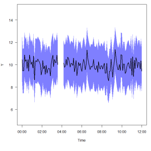
The plot above shows the kind of thing I’m talking about. I might have a series of times, or dates, or just random x data, and associated y values (a mean, and upper and lower bounds around the mean). But somewhere in the data set the y-values are missing. The goal is to simplify the process of generating the x-y pair values needed for polygon( ) to plot the error values, and automatically deal with any breaks in the data set.
The R script to generate the function polylims( ) is hosted on GitHub. The function should handle datasets with any number of missing chunks, but it will also work equally well on datasets without missing points. John McKinlay pointed me to the rle( ) function shortly after I originally posted this, and it helps shrink the amount of code considerably. The modified code is shown below:
polylims = function(xdata, ydata, ydata2) {
	# A function to find the beginings and endings of each run of real numbers
	# in a set of data, in order to create polygons for plotting. The assumption
	# is that ydata, ydata2, and xdata vectors are the same length, and that
	# the ydata and ydata2 vectors contain NA values for missing data. The
	# same values in ydata and ydata2 must be missing. The output will be
	# a list of data frames of x and y values suitable for plotting polygons.

	# Use rle function to find contiguous real numbers
	rl = rle(is.na(ydata))
	starts = vector()
	ends = vector()
	indx = 1
	for (i in 1:length(rl$lengths)){
		if (rl$values[i]){
			# Value was NA, advance index without saving the numeric values
			indx = indx + rl$lengths[i]
		} else {
			# Value was a real number, extract and save those values
			starts = c(starts,indx)
			ends = c(ends, (indx + rl$lengths[i] - 1))
			indx = indx + rl$lengths[i]
		}
	}

	# At this point the lengths of the vectors 'starts' and 'ends' should be
	# equal, and each pair of values represents the starting and ending indices
	# of a continuous set of data in the ydata vector.

	# Next separate out each set of continuous ydata, and the associated xdata,
	# and format them for plotting as a polygon.
	polylist = list()
	for (i in 1:length(starts)){
		temp = data.frame(x = c(xdata[starts[i]],xdata[starts[i]:ends[i]],
						rev(xdata[starts[i]:ends[i]])),
				y = c(ydata[starts[i]],ydata2[starts[i]:ends[i]],
						rev(ydata[starts[i]:ends[i]])))
		polylist[[i]] = temp
	}
	polylist
	# You can iterate through the items in polylist and plot them as
	# polygons on your plot. Use code similar to the following:
	#	for (i in 1:length(polylist)){
	#			polygon(polylist[[i]]$x, polylist[[i]]$y,
	#				col = rgb(0.5,0.5,0.5,0.5), border = NA)
	#	}
}
Created by Pretty R at inside-R.org
Run that once, and it creates a function called polylims that you can use in your R session. Below is an example of how I use it. We’ll start by generating some junk data consisting of a time series of y-values, with upper and lower error bounds. Assemble those into a data frame, and lose some of the data in the middle of the series.
# Create a sequence of time points
times = seq(as.POSIXct('2012-12-10 00:00'), as.POSIXct('2012-12-10 12:00'),
		by = 300)
# Create some fake y data, one value for each time point
y = rnorm(length(times), mean = 10, sd = 0.5)
# Create a fake upper standard error limit for each y data point
upperse = y + 2
# Create a fake lower standard error limit for each y data point
lowerse = y - 2
# Assemble all this into a data frame
mydata = data.frame(times, y, upperse, lowerse)

# Now we'll "lose" some data in the middle of the data set.
mydata[45:50,-1] = NA
After doing that, I’ll call the polylims( ) function, passing it the x data and the upper/lower error bounds. The original ‘y’ data aren’t needed here, just the upper/lower bounds.
# Call the polylims function, supplied with x data, and the two sets of y data
# that represent our upper and lower error boundaries here
polys = polylims(mydata$times, mydata$upperse, mydata$lowerse)
The output object ‘polys’ is a list of data frames, each containing a column x and column y, which hold the x-y pairs needed to plot each polygon. Since there is a break in the example data, ‘polys’ contains two such data frames. Continue by plotting the data.
# Draw the basic plot
plot(mydata$times, mydata$y, type = 'l', ylim = c(5,15), xlab = 'Time',
		ylab = 'Y', las = 1)
# Plot the polygons using the output from the polylims function
for(i in 1:length(polys)){
	polygon(polys[[i]]$x, polys[[i]]$y, col = rgb(0,0,1,0.5), border = NA)
}
# Replot the main y line again on top of the polygon
lines(mydata$times, mydata$y, lwd = 2, col = 'black')
The for loop in the middle steps through each of the items in the ‘polys’ list, extracts the x&y values, and uses them to draw the polygon. After drawing the polygon, it’s usually a good idea to replot the original line over top, since the polygon may obscure it.