Recently I’ve been getting my printed circuit boards manufactured through OSH Park, and they make good quality (to my eye) boards at a decent price, with less than a 2-week turnaround time. They also take files directly from Eagle software, rather than having to produce gerber files (though this is also an option).
On a recent set of orders I played around with the silkscreen label sizing in my copy of Eagle 7.2. The OSH Park guidelines say that their minimum silkscreen line thickness is 5 mils (0.005 inches). This is the thickness of the lines that make up the letters you’re trying to print, not the height of the font. I tried a couple of different font sizes and thicknesses (expressed as a ‘ratio’ in Eagle settings) in some empty real estate on my boards. The results are shown below.
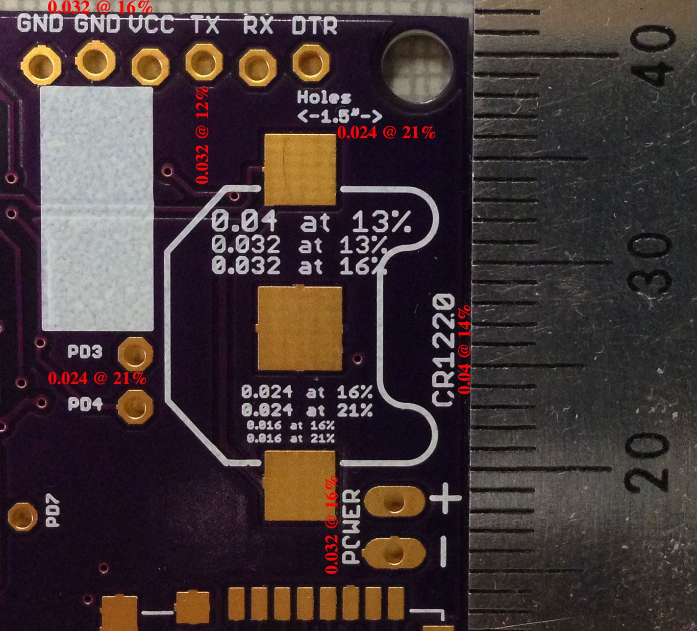
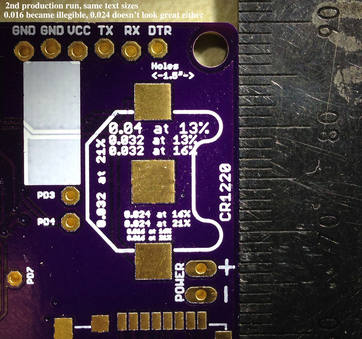
There were two separate production runs ordered about a week apart. The 1st run returned very legible text even at the smallest size of 0.016 @ 16% or 21% ratios. Unfortunately the 2nd run wasn’t as sharp, especially where the interiors of numbers and letters should be open. In particular, you can see that the 0.016 heights and 0.024 heights are completely filled in at both ratios (16% and 21%), while the 0.032 height at the thickest ratio (21%) is also filled in. A thinner ratio of 16% or 13% for the large 0.032 height was legible though.
If you’re shrinking your text down to the 0.024 or 0.016 height, you may occasionally get some illegible values, especially if you use thicker line widths. Those heights do let you squeeze text into some very small areas around tight pins, but they’re also on the cusp of requiring a magnifying glass to read if your eyes aren’t great.