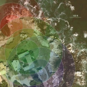
Recently, I needed to figure out how many extension cords I was going to need to buy in order to reach parts of my field site. Wandering around in the field with a surveyor’s tape was an option, but so was plotting distances on an aerial image I had of my site. What follows is a brief walk through of how I plotted stuff on top of my image in R (the open-source statistical computer software language, available at http://www.r-project.org/).
The original aerial image was 1500 x 1500 pixels. I figured out the scale in the image by opening the image in the external program ImageJ and measuring the number of pixels that made up one of the building sides (that I had previously measured in real life). Based on this, I determined that 1 pixel in my image was equal to 6 inches on the ground.
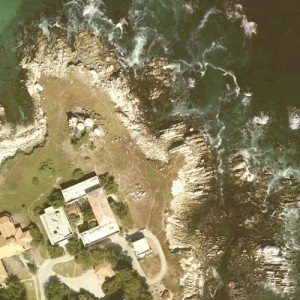
Since my goal was to get power out to my sites temporarily, I wanted to show the radius around each of the closest electrical sources that I could plug an extension cord into. Therefore, I needed to know the location of each of my three power sources in terms of their pixel coordinates in my image. That would require loading the image into a R plotting window and using the locator() function to find those pixel values.
I began by reading the jpeg image into R using the read.jpeg function from the ReadImages package.
library(ReadImages) # load the ReadImages package
j <- read.jpeg(file.choose()) # open the jpeg image and read it into an object 'j'
The image is imported as a 1500 x 1500 x 3 matrix. The next step is to plot the image in a R figure window. I wanted the figure to fill the window, so I started by setting all of the figure margins to 0, and then making a blank figure with the proper x and y dimensions to hold my image. Since I know my image is 1500×1500 pixels, I set the x limits and y limits to run from 0 to 1500. Then the rasterImage function plotted the image into the figure.
par(mar = c(0,0,0,0)) # set zero margins on all 4 sides
plot(x = NULL, y = NULL, xlim = c(0,1500), ylim = c(0,1500), pch = '',
		xaxt = 'n', yaxt = 'n', xlab = '', ylab = '', xaxs = 'i', yaxs = 'i',
		bty = 'n') # plot empty figure
rasterImage(j, xleft = 0, ybottom = 0, xright = 1500, ytop = 1500) # plot jpeg
The plotting of the image takes a few seconds, since it’s a lot of information to plot. The resulting image should completely fill the R figure window.
The next step was to determine the location of my electrical sources with reference to the dimensions of the figure. The locator() function is designed for this kind of thing.
locs <- locator(3) # I want to locate 3 points
Once you enter the locator() command, if you mouse over the figure your pointer should turn into a cross. Click on each of the points you want to store, and the x and y values will be stored in the locs object.
I wanted to plot a set of concentric circles located over the top of each of the three points I located. I wanted the circles to have diameters of 100, 200, and 300 ft to show how far I could get from each location with a string of 100ft long extension cords. Since I already knew that each pixel in the image is 6 inches on the ground, then one foot equals 2 pixels, and thus 100 ft on the ground equals 200 pixels in my image. A circle with a radius of 100ft on the ground would have a radius of 200 pixels on the image, while a circle with a 200ft radius would have a radius of 400 pixels, and a circle of radius 300ft would have a radius of 600 pixels. I used the symbols() function to plot the circles, and inside of the symbols() function I used the rgb() to specify the color and transparency of each circle.
We’ll plot the first 300ft radius (= 600 pixels) circle on top of the first point stored in locs as follows:
symbols(x = locs$x[1], y = locs$y[1], circles = 600,
		fg = 'grey', bg = rgb(0.6, 0, 0, 0.15), add = TRUE,
                inches = FALSE, lwd = 2)
In the code above, the center of the circle is given using the 1st values stored in the x and y items within locs. The color of the edge of the circle is defined by naming the color grey, while the fill color (background color, aka ‘bg’) of the circle is defined using the rgb() function, which takes 4 arguments. The first three arguments are red, green, and blue values (in that order, r-g-b) from 0 to 1. I only had one value, 0.6, for red, while the green and blue values were both zero. The fourth argument is the alpha transparency value, again from 0 to 1. My value of 0.15 is very low, so the color is mostly see-through. The other arguments to symbols can be found by typing ?symbols at the R command line.
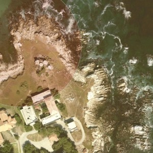
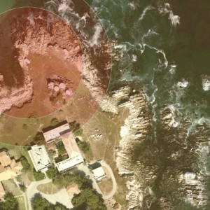
Plotting the 200ft radius circle at the first location uses very similar code, except the circle radius value is shrunk.
symbols(x = locs$x[1], y = locs$y[1], circles = 400,
		fg = 'grey', bg = rgb(0.6, 0, 0, 0.15), add = TRUE,
                inches = FALSE, lwd = 2)
Plotting circles at the other locations involves using different x and y values from locs, and changing the color values. For example, the smallest circle at my second location and the largest circle at the third location would be plotted like this:
# Plot the 100ft radius circle at the second location
symbols(x = locs$x[2], y = locs$y[2], circles = 200,
		fg = 'grey', bg = rgb(0, 0.6, 0, 0.15), add = TRUE,
                inches = FALSE, lwd = 2)
# Plot the 300ft radius circle at the third location
symbols(x = locs$x[3], y = locs$y[3], circles = 600,
		fg = 'grey', bg = rgb(0, 0, 0.6, 0.15), add = TRUE,
                inches = FALSE, lwd = 2)
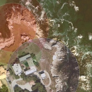
I also plotted a little point over the center of my locations. To do this I used the x and y values once again, with the points() function.
points(x = locs$x[1], y = locs$y[1], pch = 20, col = 'red')
points(x = locs$x[2], y = locs$y[2], pch = 20, col = 'blue')
points(x = locs$x[3], y = locs$y[3], pch = 20, col = 'green')
Finally, I put a scale bar in the upper right corner. I chose the location by manually inputting x and y values (since I know the maximum dimensions of the figure are still 1500×1500). The lines() function draws the line, and the text() function writes the label.
# Plot scale bar in corner
lines(x = c(1200,1400), y = c(1200,1200), lwd = 2, col = 'white')
text(x = 1300, y = 1230, labels = '100 ft', col = 'white')
In practice, I wrote all of these steps (and the extra steps not shown above) into a R script so that I could experiment with changing colors and line widths without having to retype everything at the R command line. You could also use for loops to reduce some of the redundant circle plotting commands. The output can be saved as a jpeg or in several other formats, either using the menu on the figure window, or by wrapping all of the plotting commands inside jpeg() and dev.off() calls.