Below is a walk-through of some of the basics of customizing plots in R. These are all based on the graphics package that comes in the base installation of R.
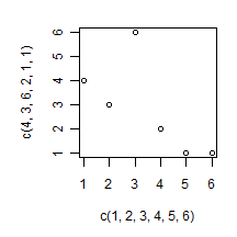
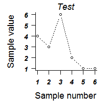
Let’s start by making a basic plot in R. In the code snippets below, green text behind a # sign is considered comments by R, so everything after a # sign on a line will be ignored by R. We’ll call the plot command and supply it with two vectors of numbers representing the x and y values:
plot(c(1,2,3,4,5,6),c(4,3,6,2,1,1)) #x and y data for our example plot
which produces this plot:

The basic plot isn’t the most attractive thing in the world. We can start prettying it up by adjusting the graphical parameters of the plot. This is most easily done by inserting parameter definitions into the plot command.
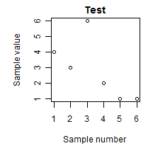
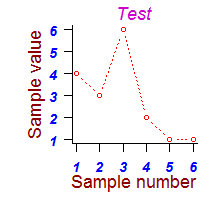
We’ll start by adding labels to the x and y axes, along with a plot title. Note the commas at the end of each line, they are important. Newly inserted code is highlighted in red:
plot(c(1,2,3,4,5,6),c(4,3,6,2,1,1), #x and y data for our example plot

xlab = "Sample number", #X axis title

ylab = "Sample value", #Y axis title

main = "Test",  #Main title of plot

)			 #Closing parenthesis for plot command
which makes the following plot:
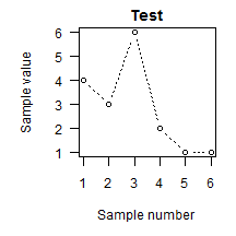
One thing that bugs me about the basic R plot is that the y-axis tick labels are rotated
to a vertical orientation. I don’t think that it’s ever advisable to make a plot
harder to read, so I like my y-axis labels horizontal. We can add one more line to
the plot command to make the tick labels horizontal:
plot(c(1,2,3,4,5,6),c(4,3,6,2,1,1), #x and y data for our example plot

xlab = "Sample number",  #X axis title

ylab = "Sample value",  #Y axis title

main = "Test", 		 #Main title of plot

las = 1,  #Rotate all tick labels horizontal

)			 #Closing parenthesis for plot command
which makes this plot:

The las parameter has 4 possible values: 0 = parallel to axis, 1 = all horizontal, 2 =
perpendicular to axis, 3 = all vertical. When we modify the las parameter in the plot
command, it applies to the tick labels on both the x and y axes at the same time.
Now we can start going hog-wild and changing other parameters to further modify the plot.
Let’s make this plot have lines between the points by setting the type parameter, and
let’s make those lines dotted using the lty parameter.
plot(c(1,2,3,4,5,6),c(4,3,6,2,1,1), #x and y data for our example plot

xlab = "Sample number",  #X axis title

ylab = "Sample value",   #Y axis title

main = "Test", 		 #Main title of plot

las = 1,	 #Rotate all tick labels horizontal

type = "b",  #Plot points with lines between them.

lty = 3, #Define line type. 0 = blank, 3 = dotted

)			 #Closing parenthesis for plot command
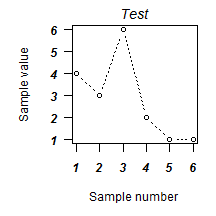
The font style and size can be modified as well. The following command will use
font.axis to change the axis tick labels to bold italics, and font.main to change the
main title to italics. Why would you ever do this? I’m not sure.
plot(c(1,2,3,4,5,6),c(4,3,6,2,1,1), #x and y data for our example plot

xlab = "Sample number",  #X axis title

ylab = "Sample value",  #Y axis title

main = "Test", 		 #Main title of plot

las = 1,		 #Rotate all tick labels horizontal

type = "b",	 #Plot points with lines between them.

lty = 3,		 #Define line type. 0 = blank, 3 = dotted

font.axis = 4, #Display axis tick labels in bold italics

font.main = 3,  #Display the main title in italics

)	 #Closing parenthesis for plot command
Next let’s try making the axis tick labels larger using cex.axis and make
the main title larger using cex.main.
plot(c(1,2,3,4,5,6),c(4,3,6,2,1,1), #x and y data for our example plot

xlab = "Sample number",  #X axis title

ylab = "Sample value",   #Y axis title

main = "Test",  #Main title of plot

las = 1,		 #Rotate all tick labels horizontal

type = "b",		 #Plot points with lines between them.

lty = 3,	 #Define line type. 0 = blank, 3 = dotted

font.axis = 4,		 #Display axis tick labels in bold italics

font.main = 3,		 #Display the main title in italics

cex.axis = 1.2, #Make axis tick labels 1.2x larger than regular font

cex.main = 1.5, #Make main title 1.5x larger than regular font size

)			 #Closing parenthesis for plot command

We can also make the axis titles larger using the cex.lab parameter:
plot(c(1,2,3,4,5,6),c(4,3,6,2,1,1), #x and y data for our example plot

xlab = "Sample number",  #X axis title

ylab = "Sample value",  #Y axis title

main = "Test", 		 #Main title of plot

las = 1,		 #Rotate all tick labels horizontal

type = "b",		 #Plot points with lines between them.

lty = 3,	 #Define line type. 0 = blank, 3 = dotted

font.axis = 4,	 #Display axis tick labels in bold italics

font.main = 3,	 #Display the main title in italics

cex.axis = 1.2,	 #Make axis tick labels 1.2x larger than regular font

cex.main = 1.5,	  	 #Make main title 1.5x larger than regular font size

cex.lab = 1.5,  #Make axis title 1.5x larger than regular font size

)	 #Closing parenthesis for plot command

Maybe the journal you’re submitting to doesn’t like figures to be enclosed in a box. The
axes that are displayed can be modified with the bty parameter. Here we’ll remove the
top and right side axes.
plot(c(1,2,3,4,5,6),c(4,3,6,2,1,1), #x and y data for our example plot

xlab = "Sample number",  #X axis title

ylab = "Sample value",  #Y axis title

main = "Test", 		 #Main title of plot

las = 1,		 #Rotate all tick labels horizontal

type = "b",		 #Plot points with lines between them.

lty = 3,	 #Define line type. 0 = blank, 3 = dotted

font.axis = 4,	 #Display axis tick labels in bold italics

font.main = 3,		 #Display the main title in italics

cex.axis = 1.2,	 #Make axis tick labels 1.2x larger than regular font

cex.main = 1.5,	 #Make main title 1.5x larger than regular font size

cex.lab = 1.5,		 #Make axis title 1.5x larger than regular font size

bty = "l",  #Specify which axes to draw (l = left + bottom)

)			 #Closing parenthesis for plot command
Perhaps you want to squeeze the axes titles in a bit closer to the actual plot. This can
be accomplished with the mgp parameter, which also affects the location of the axis
tick labels and the actual ticks. You supply mgp with a 3-value vector, where the 1st
value is the location of the axis title, the 2nd value is the tick label location, and
the 3rd value is the tick location. We’ll move the axis titles in slightly here.
plot(c(1,2,3,4,5,6),c(4,3,6,2,1,1), #x and y data for our example plot

xlab = "Sample number",  #X axis title

ylab = "Sample value",  #Y axis title

main = "Test",  #Main title of plot

las = 1,	 #Rotate all tick labels horizontal

type = "b",	 #Plot points with lines between them.

lty = 3,	 #Define line type. 0 = blank, 3 = dotted

font.axis = 4,	 #Display axis tick labels in bold italics

font.main = 3,	 #Display the main title in italics

cex.axis = 1.2,		 #Make axis tick labels 1.2x larger than regular font

cex.main = 1.5,	 #Make main title 1.5x larger than regular font size

cex.lab = 1.5,		 #Make axis title 1.5x larger than regular font size

bty = "l",		 #Specify which axes to draw (l = left + bottom)

mgp = c(2.1,1,0),  #Specify axis label + tick locations relative to plot

)	 #Closing parenthesis for plot command

Next let’s add some color to the plot (it’s going to get ugly really quick). The various
col parameters modify the colors of the plot components. If you want to know all of the
colors you can refer to by name, type colors() at the R command prompt.
plot(c(1,2,3,4,5,6),c(4,3,6,2,1,1), #x and y data for our example plot

xlab = "Sample number",  #X axis title

ylab = "Sample value", #Y axis title

main = "Test", 		 #Main title of plot

las = 1,		 #Rotate all tick labels horizontal

type = "b",	 #Plot points with lines between them.

lty = 3,		 #Define line type. 0 = blank, 3 = dotted

font.axis = 4,	 #Display axis tick labels in bold italics

font.main = 3,		 #Display the main title in italics

cex.axis = 1.2,	 #Make axis tick labels 1.2x larger than regular font

cex.main = 1.5,	  	 #Make main title 1.5x larger than regular font size

cex.lab = 1.5,	 #Make axis title 1.5x larger than regular font size

bty = "l",	 #Specify which axes to draw (l = left + bottom)

mgp = c(2.1,1,0),	 #Specify axis label + tick locations relative to plot

col = "red", #Plot the points + lines in red

col.axis = "blue", #Set the axis tick label color

col.lab = "dark red",  #Set the axis title color

col.main = "#CC00CC",  #Set the figure title color using hex values.

#Hex values are simply an alternate way to specify a

#color.

)			 #Closing parenthesis for plot command
There are lots of other parameters you can modify in your figure. You can find out about
all the other parameters by typing ? par at the R command prompt.
One of the other things you might want to do is insert special characters in the axis
titles. For instance, maybe the units of our y-axis are actually degrees Celsius. Getting
a degree symbol is slightly more involved, but here’s one way to do it:
plot(c(1,2,3,4,5,6),c(4,3,6,2,1,1), #x and y data for our example plot

xlab = "Sample number",  #X axis title

ylab = expression(paste("Temp, ",degree,"C")),  #Y axis title

main = "Test",  #Main title of plot

las = 1,		 #Rotate all tick labels horizontal

)	 #Closing parenthesis for plot command
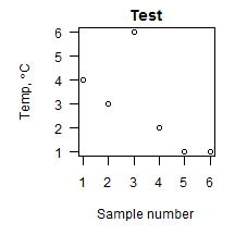
In the code above, the ylab = expression(paste("Temp, ",degree,"C")), is doing something exciting. Using expression tells R to evaluate the code inside the parentheses. Inside those parentheses, we have a paste command, which tells R to stick the items inside paste’s parentheses together in a string. This combination of commands instructs R to create a string, but evaluate any special code words first. In this case, the code word is degree, which R turns into a degree symbol and sticks in between the "Temp, " and "C" strings.
There may also be instances where you want one of your axes to have different fonts,
colors, size etc. This is accomplished by first suppressing the text for that axis in the
plot command using the yaxt or xaxt parameters, and then using a subsequent command
like axis to modify the desired axis. In the example below, we’re going to suppress the
y-axis using the yaxt = "n" parameter inside the plot command. Then we’ll
follow the plot command with the axis command wherein we lay out the parameters of the
y-axis. When the plot command is called, R still calculates where to put the y-axis
labels and what their values should be, and it holds these in memory so that you can use
them with the axis command.
plot(c(1,2,3,4,5,6),c(4,3,6,2,1,1), #x and y data for our example plot

xlab = "Sample number",  #X axis title

ylab = expression(paste("Temp, ",degree,"C")),   #Y axis title

main = "Test",  #Main title of plot

las = 1,	 #Rotate all tick labels horizontal

yaxt = "n", #Suppress y-axis tick labels and title

)	 #Closing parenthesis for plot command
axis(2, #Define which axis to modify. 1 = bottom x-axis, 2 = left y-axis, 3 = top etc...

las = 1,  #Set tick label orientation (1 = horizontal)

cex.axis = 0.8,  #Set font size (0.8 times current font size)

font.axis = 3,  #Set font style (bold,italics etc, 3 = italics)

col.axis = "tan4", #Set axis color

)  #Closing parenthesis for axis command

Finally, you can drop text notations on the plot using the text command and specifying
the x,y location of the text. Again we’ll use a greek symbol here.
plot(c(1,2,3,4,5,6),c(4,3,6,2,1,1), #x and y data for our example plot

xlab = "Sample number",  #X axis title

ylab = expression(paste("Temp, ",degree,"C")),  #Y axis title

main = "Test",  #Main title of plot

las = 1,		 #Rotate all tick labels horizontal

yaxt = "n",	 #Suppress y-axis tick labels and title

)	 #Closing parenthesis for plot command
text(2,2,expression(paste(Delta,"T")))

You can construct more elaborate labels using the facilities found in the R help for plotmath. For example, we can construct a y-axis label with a combination of normal text, italics, a greek symbol, and some superscripts using the plain() and italic() functions (there are also bold and bolditalic options as well). In this case, we will construct the label before issuing the
plot command.
mylab = expression(paste(plain('Final '),

italic('per capita '),

plain('rate ('), #that is an opening parenthesis inside the quotes

plain(mu), #greek symbols have special code words

plain('g snail '^{-1}), #superscript goes outside the quotes

plain('day'^{-1}),

plain(')')  )) #there is a closing parenthesis in those quotes
The above command uses expression() to create an expression object called mylab that is stored in memory. Inside the expression() command, we use paste() to paste together several plain and italic text strings. Note that we surround per capita with an italic() command to italicize those words. The greek symbol mu is inserted by simply typing mu, without quote marks around it (similar to how we displayed the Delta symbol above). The superscript -1 symbols are written outside of quotes as well, but inside the plain() parentheses. The use of the ^{ } symbols around the -1 tells R that we want everything inside the curly braces to be superscript (this is essentially TeX syntax, if you’re familiar with it). To make a subscript, you would use square braces [ ], and surround text with quotes inside the braces.
After defining that mess of a label, we once again create our basic plot and instead of supplying a string for the ylab argument, we simply supply the expression stored in ‘mylab’ which is converted to text by R.
plot(c(1,2,3,4,5,6),c(4,3,6,2,1,1),

xlab = 'Sample Number',

ylab = mylab, #use mylab for the y-label. Do not put quotes around mylab.

las = 1,

)

For even more info on graphing in R and general R usage, I have found the Quick-R site extremely informative. The sections on graphs and advanced graphs are quite helpful.