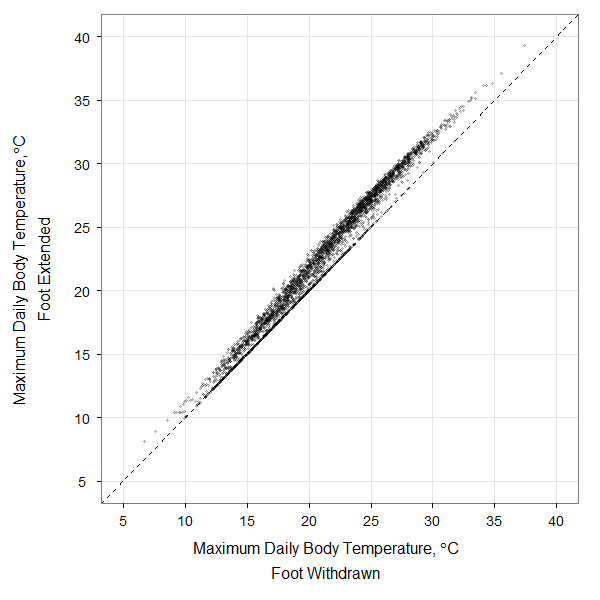
Here’s a bit of code used to produce one of the figures in my recent paper dealing with modeling rocky intertidal snail body temperatures. This was my first foray into ggplot2, and it only involved a few hours of head-scratching. The plot is a comparison of 10 years of daily maximum body temperatures of a modeled littorine snail sitting on a rock with its foot out on the rock or withdrawn into the shell. The original data are here: dailymax_runs139_169.
The code below will open the data file, create the ggplot2 figure, and save the output to a .png file like that shown here. With ~3650 data points plotted, this sort of figure is right on the cusp where you should consider submitting it as a high-resolution tiff or png file rather than as a vector graphic (pdf or svg), since plotting all of those individual points in a vector graphic format can take quite a while.

library(ggplot2) #load ggplot2 package

df = read.csv(file.choose()) #Load the data into a data frame
colnames(df) = c("Foot.in", "Foot.out","Matlab.Day") #rename columns

previous.theme = theme_set(theme_bw()) #set black and white ggplot theme

#Define data to be plotted
dfplot = ggplot(df, aes(x = Foot.in, y = Foot.out))

#Assemble a x-axis title. The 'atop' function allows you to have two lines of
#text in a pasted-together expression
my.xlab = expression(atop(paste("Maximum Daily Body Temperature, ", degree,"C"),
				"Foot Withdrawn"))
#Assemble a y-axis title using the same method. Two spaces are needed after
#"Temperature" to make proper spacing on the y-axis title for some reason
my.ylab = expression(atop(paste("Maximum Daily Body Temperature,  ", degree,"C"),
				"Foot Extended"))

#Open a new png device to print the figure out to (or use tiff, pdf, etc).
png(filename = "figure_x.png", width = 600, height = 600, units = 'px')
print(dfplot +
				#Define point shape and set alpha transparency
				geom_point(shape = 20, color = alpha("black",1/5)) +
				#draw a dashed line of unity with geom_abline
				geom_abline(intercept = 0, slope = 1, linetype = 2) +
				xlab(my.xlab) +  #insert the x-axis title
				ylab(my.ylab) +  #insert the y-axis title
				xlim(5,40) +  #set the x-axis limits explicitly
				ylim(5,40) +  #set the y-axis limits explicitly
				#Adjust the plot margins slightly
				opts(plot.margin = unit(c(1,1,2,2), "lines")) +
				#Adjust the font size and margin location of the x-axis title
				opts(axis.title.x = theme_text(size = 16, vjust = -1)) +
				#Adjust the font, angle, and margin location of the y-axis title
				opts(axis.title.y = theme_text(size = 16, angle = 90, vjust = 0.25)) +
				#Adjust the font size of the tick labels on the x-axis
				opts(axis.text.x = theme_text(size = 14)) +
				#Adjust the font size of the tick labels on the y-axis
				opts(axis.text.y = theme_text(size = 14)) +
				#Draw only the major grid lines
				opts(panel.grid.minor = theme_blank())
) #end of print statement
dev.off() #close the png device to save the figure.
Created by Pretty R at inside-R.org
Though the two scatterplots from the paper were generated in this manner, I put together the final 2-panel figure with illustrated snails on it using Adobe Illustrator. It could have all been accomplished in R, but by that point I had already spent enough time wrestling with ggplot2. The actual paper can be found at the Biological Bulletin.
