In the previous post, I outlined some tips for increasing the size of figure labels for figures that are meant to be displayed on a projector. The previous post used the base R plot() function, but the procedure when plotting with ggplot2 is different and usually quite a bit simpler than the stock R plotting functions. As before, I’m outputting the figures here as 1024×768 PNG image files, since they’re sure to work in whatever version of PowerPoint or Keynote you’re stuck using.
I’ll begin by generating some random data and dates to use in the plots. Since ggplot2 is an add-on package, it also needs be loaded by R before plotting.
[code lang=”r”]
df = data.frame(x = rnorm(30), y = runif(30,min = 10,max = 10000),
dates = seq(as.Date(‘2013-12-01’),(as.Date(‘2013-12-01’)+29), by = 1))
# load libraries
require(ggplot2)
[/code]
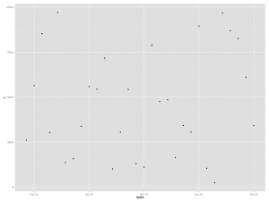
To output a PNG file, you start by calling the png() function and feeding it some arguments to lay out the size of the output figure. Follow that with your ggplot2 commands, then a print() to print the figure to disk, and finish with dev.off() to save the file.
[code lang=”r”]
png(file = "pngtest9.png", width = 1024, height = 768, units = ‘px’)
# lay out basic figure
mygraph = ggplot(data = df, aes(x = dates, y = y))
mygraph = mygraph + geom_point()
print(mygraph)
dev.off() # close plot and save to disk
[/code]

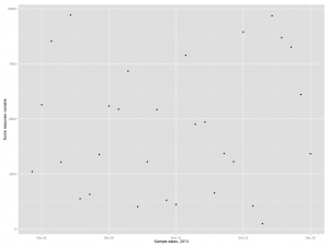
We ought to add some axis labels to the existing graph object:
[code lang=”r”]
mygraph = mygraph + xlab("Sample dates, 2013")
mygraph = mygraph + ylab("Some response variable")
png(file = "pngtest10.png", width = 1024, height = 768, units = ‘px’)
print(mygraph)
dev.off()
[/code]

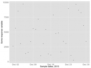
The default font sizes in the output figure are far too small to read on a projector. To correct this, you can quickly modify the existing graph object to inflate the label sizes. The built-in formatting in ggplot2 makes this procedure much simpler than in the standard plot() function, since ggplot2 shoves the margins around to make things fit nicely for you. The size = rel(2) argument increases the labels to 2x the default size.
[code lang=”r”]
# Increase size of all axis labels
mygraph = mygraph + theme(axis.text = element_text(size = rel(2)))
mygraph = mygraph + theme(axis.title = element_text(size = rel(2)))
png(file = "pngtest11.png", width = 1024, height = 768, units = ‘px’)
print(mygraph)
dev.off()
[/code]

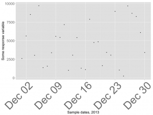
With large labels on the x-axis like this, if you want to print them any larger it becomes necessary to rotate them to squeeze a decent number of labels in. Thankfully this is simple to do in ggplot2.
[code lang=”r”]
# Rotate x axis tick labels and increase size even further
mygraph = mygraph + theme(axis.text.x = element_text(angle = 45, vjust = 0.9,
hjust = 0.9, size = rel(3)))
png(file = "pngtest12.png", width = 1024, height = 768, units = ‘px’)
print(mygraph)
dev.off()
[/code]
